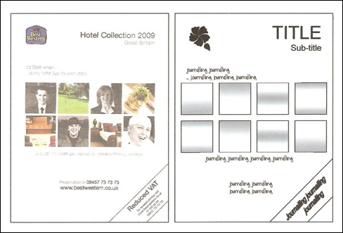
It’s Scrap Map Saturday again at Creative Craft World and here is another of my scrap maps using commercial design as inspiration. This one is based on a Best Western Hotel catalogue!
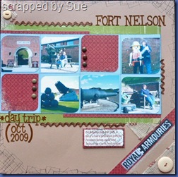
Here’s what I did with it…
Pop over to the blog to see how you can play along and maybe win a guest design spot for February.
Sue x


5 comments:
Hi Sue, another great sketch from you. I love how you have been inspired. Well I'll never make any promises, but as I'm on hols and as i've already done the wc, I hope i'll get this done! I think these type of sketches help to shift a few otherwise awkward photos.
I love yours, expecially how you've used the rikrak. xx Jen
Love what you've done with the sketch. I think I would struggle using 8 photos but I like how you've just done c/s in 2 of the squares.
I love this LO Sue - and I enjoyed following the sketch - thank you for a fab sketch x x
A really nice sketch - thanks for creating it :)
I like what you did with this sketch. You are very talented.
Post a Comment